build a strong intuition for how they work and how to interpret hierarchical clustering and k-means clustering results
machine-learning
cluster-analysis
r
Author
Victor Omondi
Published
October 19, 2020
Overview
Cluster analysis is a powerful toolkit in the data science workbench. It is used to find groups of observations (clusters) that share similar characteristics. These similarities can inform all kinds of business decisions; for example, in marketing, it is used to identify distinct groups of customers for which advertisements can be tailored. We will explore two commonly used clustering methods - hierarchical clustering and k-means clustering. We’ll build a strong intuition for how they work and how to interpret their results. We’ll develop this intuition by exploring three different datasets: soccer player positions, wholesale customer spending data, and longitudinal occupational wage data.
Warning message:
"package 'tibble' was built under R version 3.6.3"Warning message:
"package 'tidyr' was built under R version 3.6.3"
Calculating distance between observations
Cluster analysis seeks to find groups of observations that are similar to one another, but the identified groups are different from each other. This similarity/difference is captured by the metric called distance. We will calculate the distance between observations for both continuous and categorical features. We will also develop an intuition for how the scales of features can affect distance.
What is cluster analysis?
A form of exploratory data analysis (EDA) where observations are divided into meaningful groups that share common characteristics(features).
When to cluster?
Identifying distinct groups of stocks that follow similar trading patterns.
Using consumer behavior data to identify distinct segments within a market.
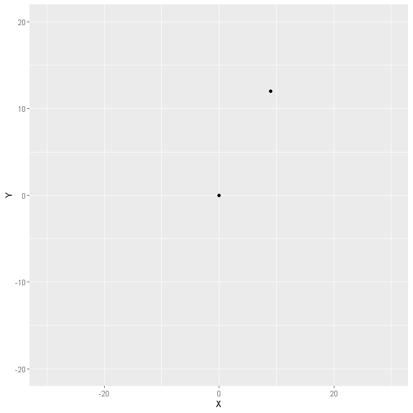
# Plot the positions of the playersggplot(two_players, aes(x = X, y = Y)) +geom_point() +# Assuming a 40x60 fieldlims(x =c(-30,30), y =c(-20, 20))
# Split the players data frame into two observationsplayer1 <- two_players[1, ]player2 <- two_players[2, ]# Calculate and print their distance using the Euclidean Distance formulaplayer_distance <-sqrt( (player1$X - player2$X)^2+ (player1$Y - player2$Y)^2 )player_distance
15
The dist() function makes life easier when working with many dimensions and observations.
dist(three_players)
         1        2
2 15.00000
3 19.10497 13.03840
three_players
X
Y
0
0
9
12
-2
19
The importance of scale
when a variable is on a larger scale than other variables in data it may disproportionately influence the resulting distance calculated between the observations.
scale() function by default centers & scales column features.
# Dummify the Survey Datadummy_survey <-dummy.data.frame(job_survey)# Calculate the Distancedist_survey <-dist(dummy_survey, method="binary")# Print the Distance Matrixdist_survey
this distance metric successfully captured that observations 1 and 2 are identical (distance of 0)
Hierarchical clustering
How do you find groups of similar observations (clusters) in data using the calculated distances? We will explore the fundamental principles of hierarchical clustering - the linkage criteria and the dendrogram plot - and how both are used to build clusters. We will also explore data from a wholesale distributor in order to perform market segmentation of clients using their spending habits.
Comparing more than two observations
Hierarchical clustering
Complete Linkage: maximum distance between two sets
Single Linkage: minimum distance between two sets
Average Linkage: average distance between two sets
Capturing K clusters
Hierarchical clustering in R
hclust() function to calculate the iterative linkage steps
cutree() function to extract the cluster assignments for the desired number (k) of clusters.
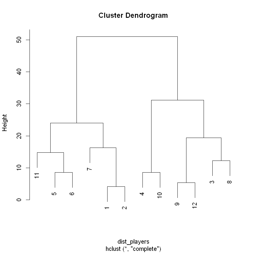
positions of 12 players at the start of a 6v6 soccer match.
players_clustered data frame contains the x & y positions of 12 players at the start of a 6v6 soccer game to which we have added clustering assignments based on the following parameters:
Distance: Euclidean
Number of Clusters (k): 2
Linkage Method: Complete
Exploring the clusters
# Count the cluster assignmentscount(players_clustered, cluster)
cluster
n
1
6
2
6
Visualizing K Clusters
Because clustering analysis is always in part qualitative, it is incredibly important to have the necessary tools to explore the results of the clustering.
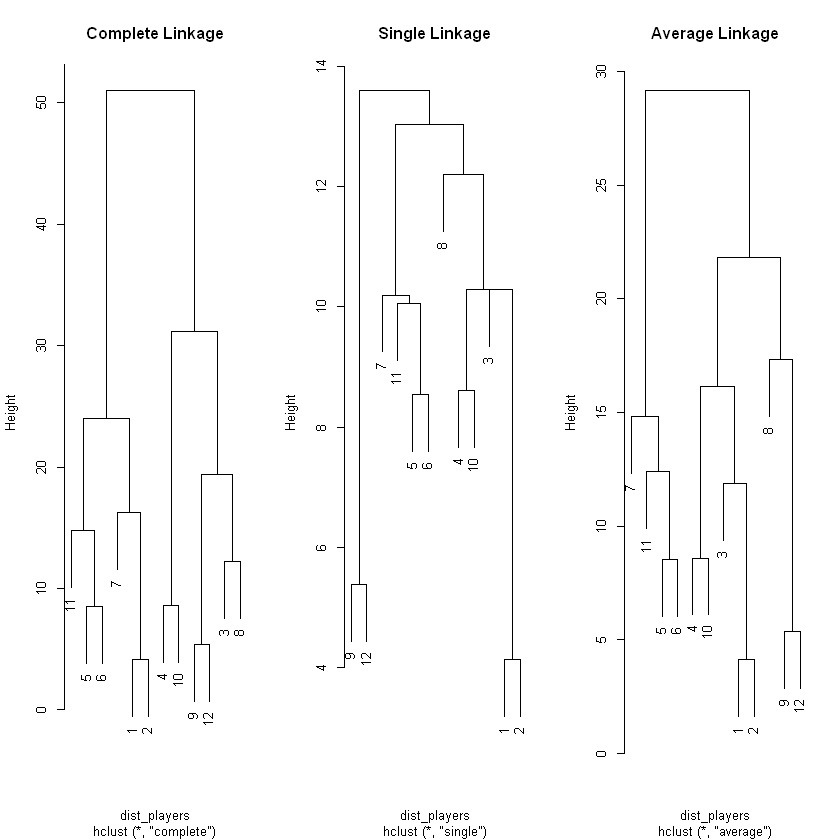
# Prepare the Distance Matrixdist_players <-dist(players)# Generate hclust for complete, single & average linkage methodshc_complete <-hclust(dist_players, method="complete")hc_single <-hclust(dist_players, method="single")hc_average <-hclust(dist_players, method="average")# Plot & Label the 3 Dendrograms Side-by-Side# Hint: To see these Side-by-Side run the 4 lines together as one commandpar(mfrow =c(1,3))plot(hc_complete, main ='Complete Linkage')plot(hc_single, main ='Single Linkage')plot(hc_average, main ='Average Linkage')
Height of the tree
An advantage of working with a clustering method like hierarchical clustering is that you can describe the relationships between your observations based on both the distance metric and the linkage metric selected (the combination of which defines the height of the tree).
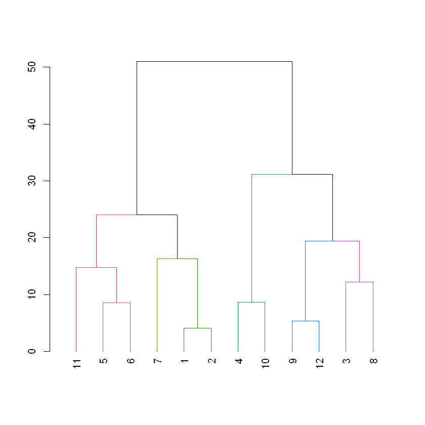
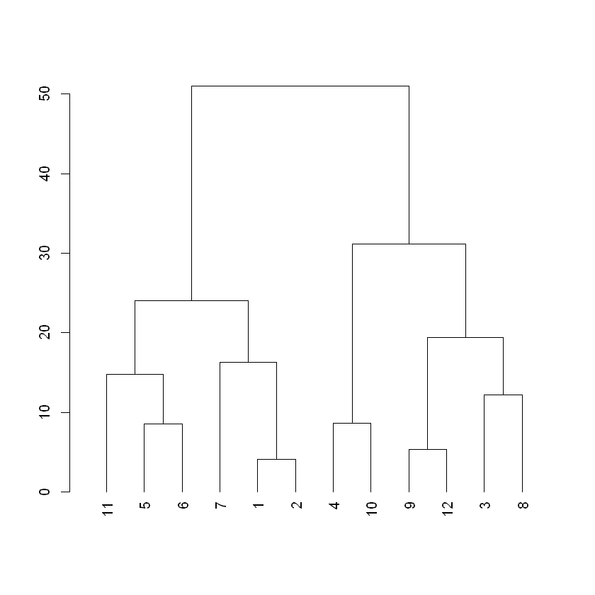
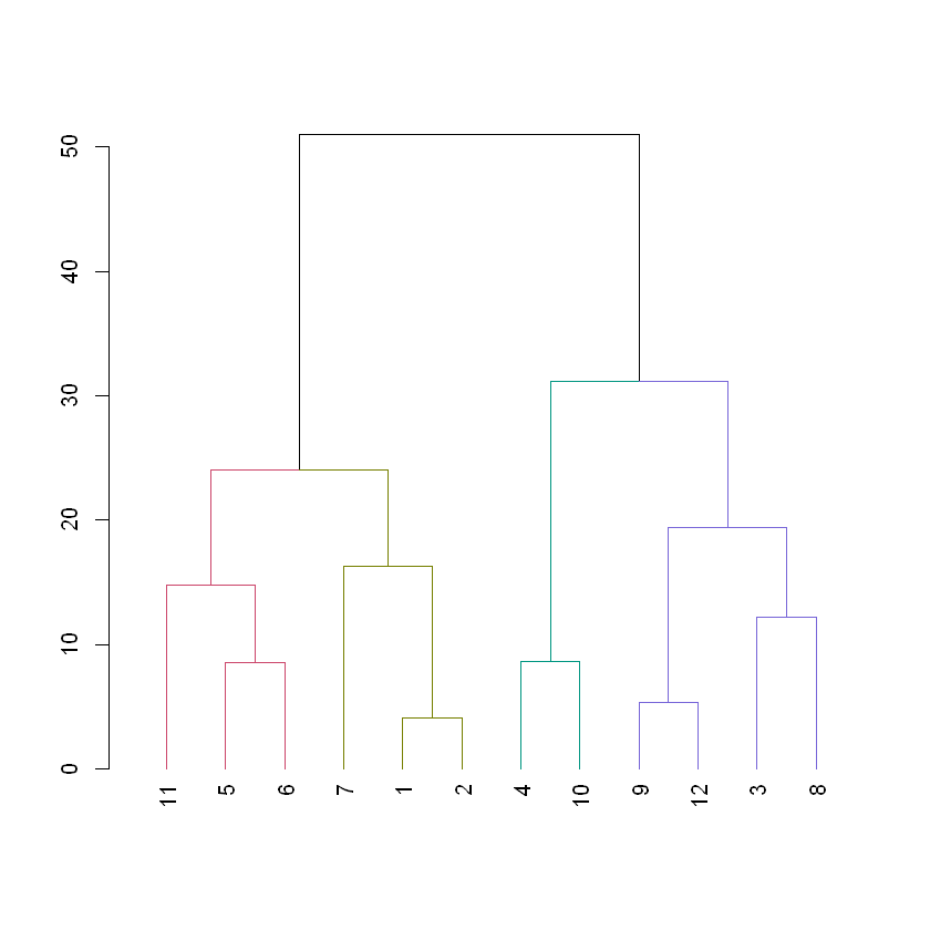
dist_players <-dist(players, method ='euclidean')hc_players <-hclust(dist_players, method ="complete")# Create a dendrogram object from the hclust variabledend_players <-as.dendrogram(hc_players)# Plot the dendrogramplot(dend_players)
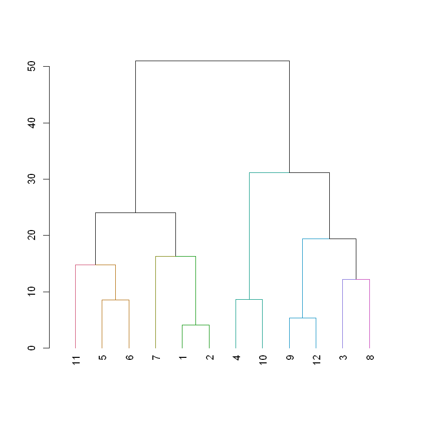
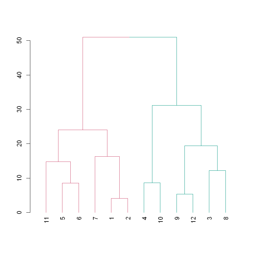
# Color branches by cluster formed from the cut at a height of 20 & plotdend_20 <-color_branches(dend_players, h =20)# Plot the dendrogram with clusters colored below height 20plot(dend_20)
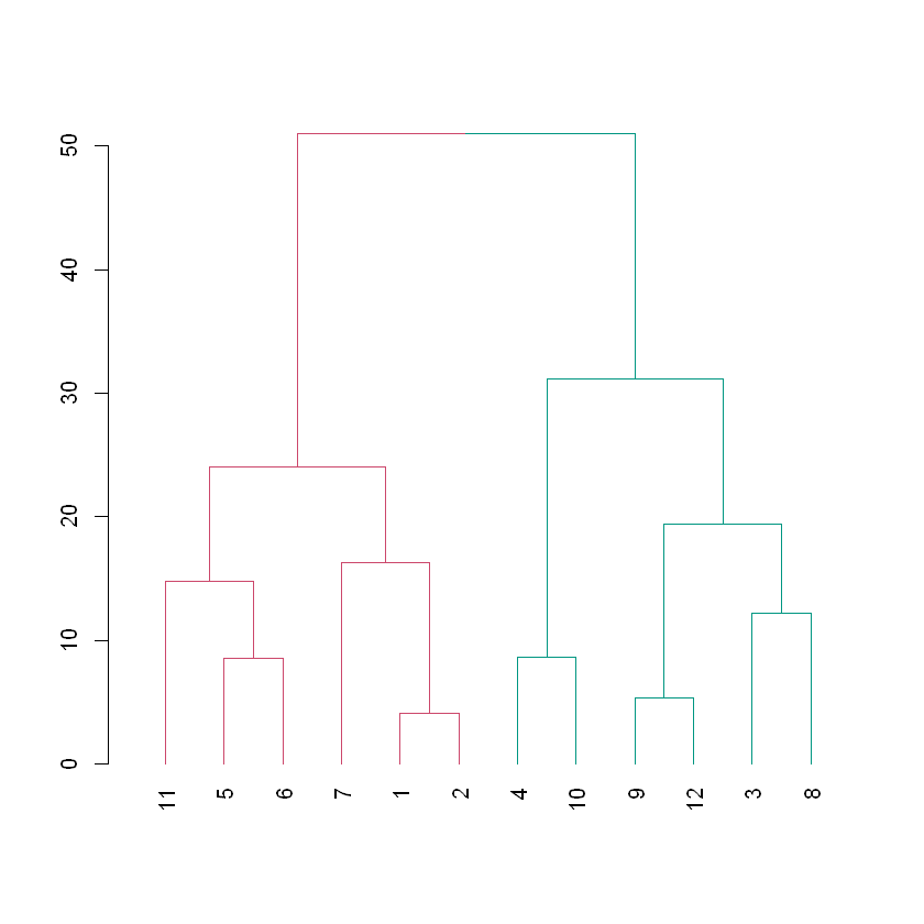
# Color branches by cluster formed from the cut at a height of 40 & plotdend_40 <-color_branches(dend_players, h=40)# Plot the dendrogram with clusters colored below height 40plot(dend_40)
The height of any branch is determined by the linkage and distance decisions (in this case complete linkage and Euclidean distance). While the members of the clusters that form below a desired height have a maximum linkage+distance amongst themselves that is less than the desired height.
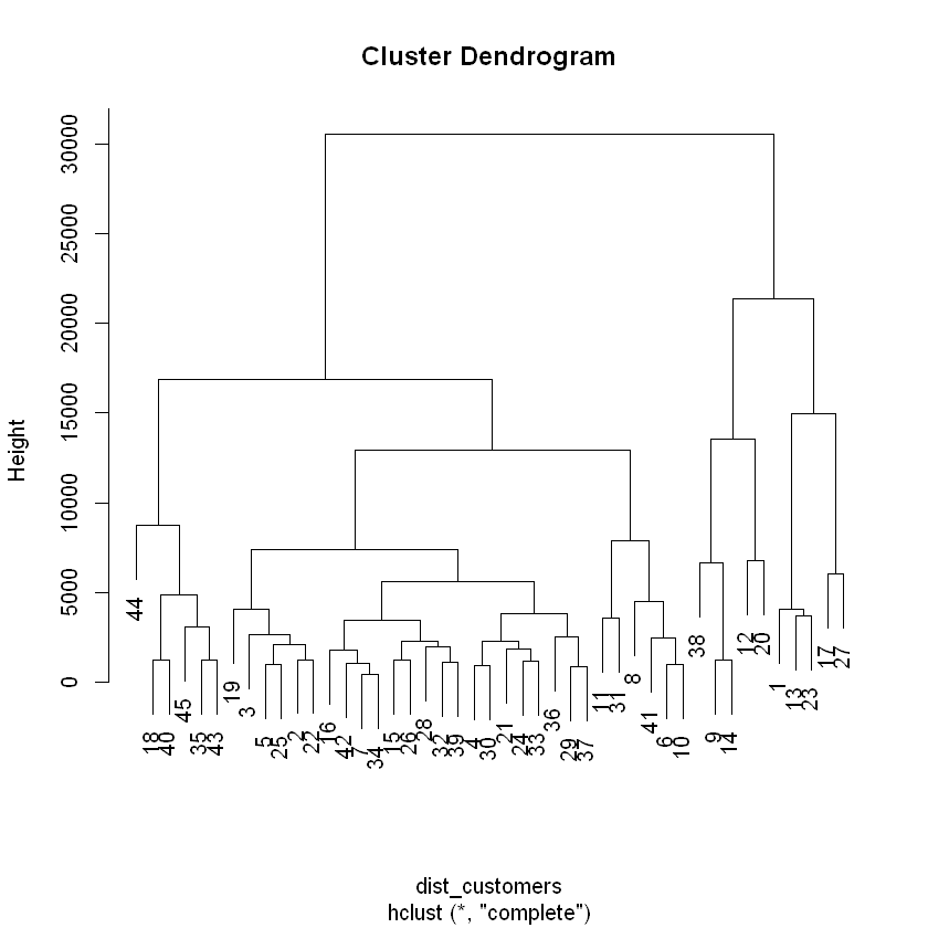
# Calculate Euclidean distance between customersdist_customers <-dist(ws_customers, method="euclidean")# Generate a complete linkage analysis hc_customers <-hclust(dist_customers, method="complete")# Plot the dendrogramplot(hc_customers)
# Create a cluster assignment vector at h = 15000clust_customers <-cutree(hc_customers, h=15000)# Generate the segmented customers data framehead( segment_customers <-mutate(ws_customers, cluster = clust_customers), 10)
Milk
Grocery
Frozen
cluster
11103
12469
902
1
2013
6550
909
2
1897
5234
417
2
1304
3643
3045
2
3199
6986
1455
2
4560
9965
934
2
879
2060
264
2
6243
6360
824
2
13316
20399
1809
3
5302
9785
364
2
Explore wholesale customer clusters
Since we are working with more than 2 dimensions it would be challenging to visualize a scatter plot of the clusters, instead we will rely on summary statistics to explore these clusters. We will analyze the mean amount spent in each cluster for all three categories.
# Count the number of customers that fall into each clustercount(segment_customers, cluster)
cluster
n
1
5
2
29
3
5
4
6
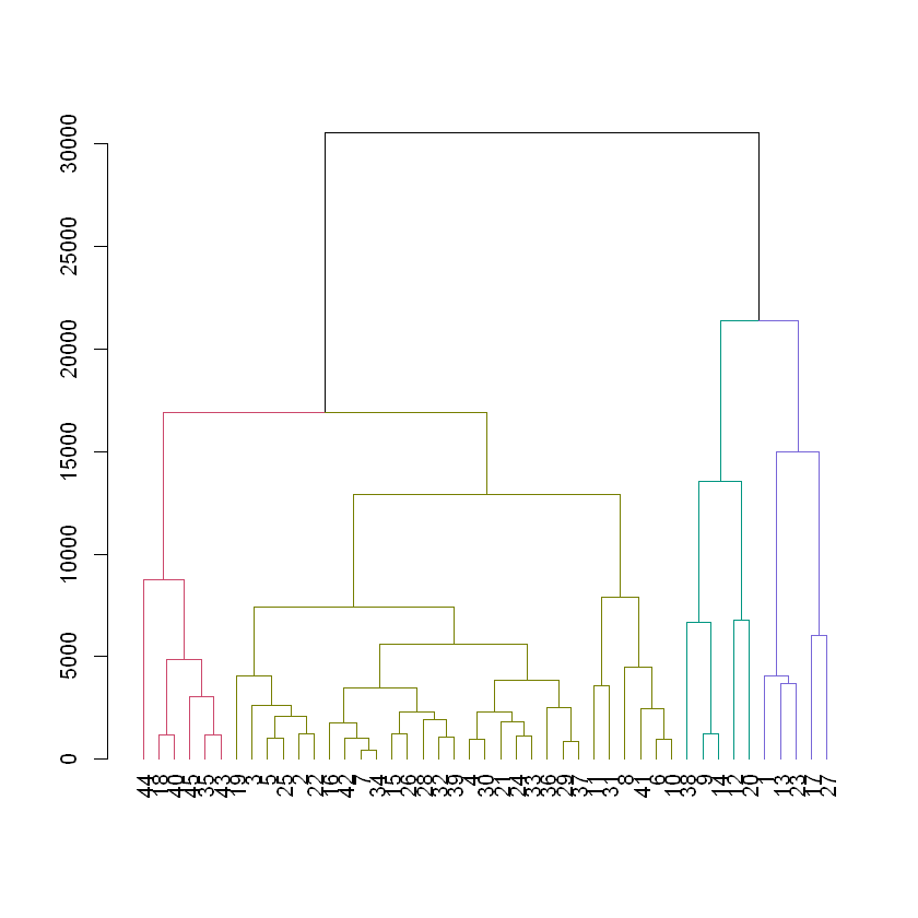
# Color the dendrogram based on the height cutoffdend_customers <-as.dendrogram(hc_customers)dend_colored <-color_branches(dend_customers, h=15000)# Plot the colored dendrogramplot(dend_colored)
# Calculate the mean for each categorysegment_customers %>%group_by(cluster) %>%summarise_all(list(mean))
cluster
Milk
Grocery
Frozen
1
16950.000
12891.400
991.200
2
2512.828
5228.931
1795.517
3
10452.200
22550.600
1354.800
4
1249.500
3916.833
10888.667
Customers in cluster 1 spent more money on Milk than any other cluster.
Customers in cluster 3 spent more money on Grocery than any other cluster.
Customers in cluster 4 spent more money on Frozen goods than any other cluster.
The majority of customers fell into cluster 2 and did not show any excessive spending in any category.
whether they are meaningful depends heavily on the business context of the clustering.
K-means clustering
Build an understanding of the principles behind the k-means algorithm, explore how to select the right k when it isn’t previously known, and revisit the wholesale data from a different perspective.
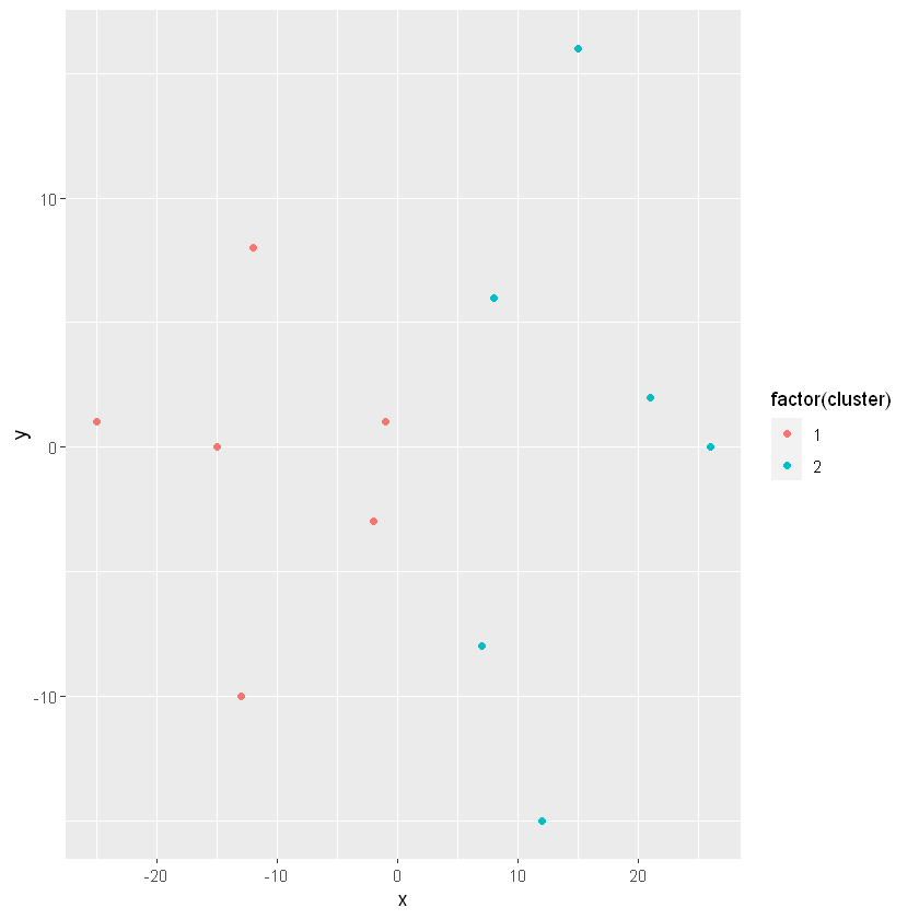
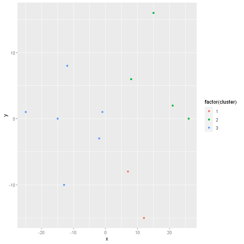
# Build a kmeans modelmodel_km2 <-kmeans(lineup, centers =2)# Extract the cluster assignment vector from the kmeans modelclust_km2 <- model_km2$cluster# Create a new data frame appending the cluster assignmentlineup_km2 <-mutate(lineup, cluster = clust_km2)# Plot the positions of the players and color them using their clusterggplot(lineup_km2, aes(x = x, y = y, color =factor(cluster))) +geom_point()
K-means on a soccer field (part 2)
# Build a kmeans modelmodel_km3 <-kmeans(lineup, centers=3)# Extract the cluster assignment vector from the kmeans modelclust_km3 <- model_km3$cluster# Create a new data frame appending the cluster assignmentlineup_km3 <-mutate(lineup, cluster=clust_km3)# Plot the positions of the players and color them using their clusterggplot(lineup_km3, aes(x = x, y = y, color =factor(cluster))) +geom_point()
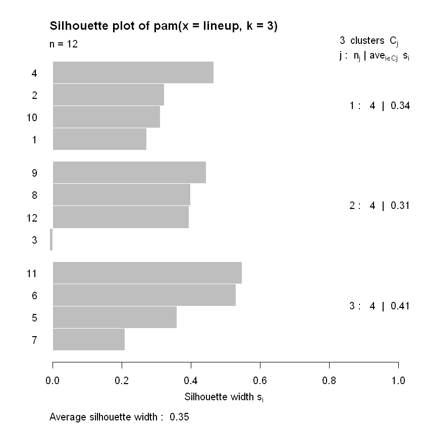
Silhouette analysis allows you to calculate how similar each observations is with the cluster it is assigned relative to other clusters. This metric (silhouette width) ranges from -1 to 1 for each observation in your data and can be interpreted as follows:
Values close to 1 suggest that the observation is well matched to the assigned cluster
Values close to 0 suggest that the observation is borderline matched between two clusters
Values close to -1 suggest that the observations may be assigned to the wrong cluster
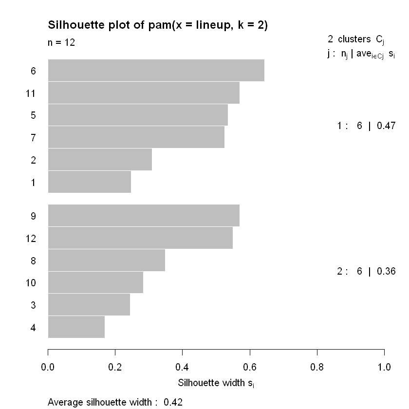
# Generate a k-means model using the pam() function with a k = 2pam_k2 <-pam(lineup, k =2)# Plot the silhouette visual for the pam_k2 modelplot(silhouette(pam_k2))
for k = 2, no observation has a silhouette width close to 0? What about the fact that for k = 3, observation 3 is close to 0 and is negative? This suggests that k = 3 is not the right number of clusters.
Estimate the “best” k using average silhouette width
Run k-means with the suggested k
Characterize the spending habits of these clusters of customers
Revisiting wholesale data: “Best” k
head(ws_customers, 10)
Milk
Grocery
Frozen
11103
12469
902
2013
6550
909
1897
5234
417
1304
3643
3045
3199
6986
1455
4560
9965
934
879
2060
264
6243
6360
824
13316
20399
1809
5302
9785
364
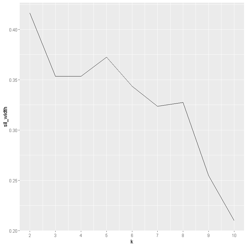
# Use map_dbl to run many models with varying value of ksil_width <-map_dbl(2:10, function(k){ model <-pam(x = ws_customers, k = k) model$silinfo$avg.width})# Generate a data frame containing both k and sil_widthsil_df <-data.frame(k =2:10,sil_width = sil_width)# Plot the relationship between k and sil_widthggplot(sil_df, aes(x = k, y = sil_width)) +geom_line() +scale_x_continuous(breaks =2:10)
k = 2 has the highest average sillhouette width and is the “best” value of k we will move forward with.
Revisiting wholesale data: Exploration
From the previous analysis we have found that k = 2 has the highest average silhouette width. We will continue to analyze the wholesale customer data by building and exploring a kmeans model with 2 clusters.
set.seed(42)# Build a k-means model for the customers_spend with a k of 2model_customers <-kmeans(ws_customers, centers=2)# Extract the vector of cluster assignments from the modelclust_customers <- model_customers$cluster# Build the segment_customers data framesegment_customers <-mutate(ws_customers, cluster = clust_customers)# Calculate the size of each clustercount(segment_customers, cluster)
cluster
n
1
35
2
10
# Calculate the mean for each categorysegment_customers %>%group_by(cluster) %>%summarise_all(list(mean))
cluster
Milk
Grocery
Frozen
1
2296.257
5004
3354.343
2
13701.100
17721
1173.000
It seems that in this case cluster 1 consists of individuals who proportionally spend more on Frozen food while cluster 2 customers spent more on Milk and Grocery. When we explored this data using hierarchical clustering, the method resulted in 4 clusters while using k-means got us 2. Both of these results are valid, but which one is appropriate for this would require more subject matter expertise. Generating clusters is a science, but interpreting them is an art.
Case Study: National Occupational mean wage
Explore how the average salary amongst professions have changed over time.
Occupational wage data
data from the Occupational Employment Statistics (OES) program which produces employment and wage estimates annually. This data contains the yearly average income from 2001 to 2016 for 22 occupation groups. We would like to use this data to identify clusters of occupations that maintained similar income trends.
oes <-readRDS(gzcon(url("https://assets.datacamp.com/production/repositories/1219/datasets/1e1ec9f146a25d7c71a6f6f0f46c3de7bcefd36c/oes.rds")))head(oes)
      2001            2002            2003            2004
 Min.   :16720   Min.   :17180   Min.   :17400   Min.   :17620
 1st Qu.:26728   1st Qu.:27393   1st Qu.:27858   1st Qu.:28535
 Median :34575   Median :35205   Median :36180   Median :37335
 Mean   :37850   Mean   :39701   Mean   :41018   Mean   :42275
 3rd Qu.:49875   3rd Qu.:53108   3rd Qu.:55733   3rd Qu.:57443
 Max.   :70800   Max.   :78870   Max.   :83400   Max.   :87090
      2005            2006            2007            2008
 Min.   :17840   Min.   :18430   Min.   :19440   Min.   : 20220
 1st Qu.:29043   1st Qu.:29688   1st Qu.:30810   1st Qu.: 31643
 Median :37790   Median :39030   Median :40235   Median : 41510
 Mean   :42775   Mean   :44329   Mean   :46074   Mean   : 47763
 3rd Qu.:58005   3rd Qu.:59915   3rd Qu.:62313   3rd Qu.: 64610
 Max.   :88450   Max.   :91930   Max.   :96150   Max.   :100310
      2010             2011             2012             2013
 Min.   : 21240   Min.   : 21430   Min.   : 21380   Min.   : 21580
 1st Qu.: 32863   1st Qu.: 33430   1st Qu.: 33795   1st Qu.: 34120
 Median : 42995   Median : 43610   Median : 44055   Median : 44565
 Mean   : 49758   Mean   : 50555   Mean   : 51077   Mean   : 51800
 3rd Qu.: 67365   3rd Qu.: 68423   3rd Qu.: 69253   3rd Qu.: 70615
 Max.   :105440   Max.   :107410   Max.   :108570   Max.   :110550
      2014             2015             2016
 Min.   : 21980   Min.   : 22850   Min.   : 23850
 1st Qu.: 34718   1st Qu.: 35425   1st Qu.: 36350
 Median : 45265   Median : 46075   Median : 46945
 Mean   : 52643   Mean   : 53785   Mean   : 55117
 3rd Qu.: 71825   3rd Qu.: 73155   3rd Qu.: 74535
 Max.   :112490   Max.   :115020   Max.   :118020
dim(oes)
22
15
there are no missing values, no categorical and the features are on the same scale.
Next steps: hierarchical clustering
Evaluate whether pre-processing is necessary
Create a distance matrix
Build a dendrogram
Extract clusters from dendrogram
Explore resulting clusters
Hierarchical clustering: Occupation trees
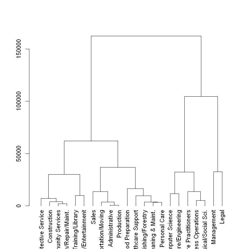
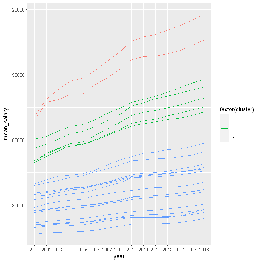
The oes data is ready for hierarchical clustering without any preprocessing steps necessary. We will take the necessary steps to build a dendrogram of occupations based on their yearly average salaries and propose clusters using a height of 100,000.
# Calculate Euclidean distance between the occupationsdist_oes <-dist(oes, method ="euclidean")# Generate an average linkage analysis hc_oes <-hclust(dist_oes, method ="average")# Create a dendrogram object from the hclust variabledend_oes <-as.dendrogram(hc_oes)# Plot the dendrogramplot(dend_oes)
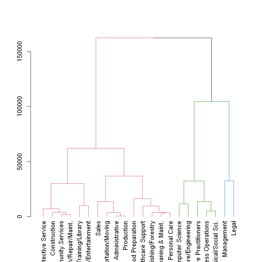
# Color branches by cluster formed from the cut at a height of 100000dend_colored <-color_branches(dend_oes, h =100000)# Plot the colored dendrogramplot(dend_colored)
Based on the dendrogram it may be reasonable to start with the three clusters formed at a height of 100,000. The members of these clusters appear to be tightly grouped but different from one another. Let’s continue this exploration.
Hierarchical clustering: Preparing for exploration
We have now created a potential clustering for the oes data, before we can explore these clusters with ggplot2 we will need to process the oes data matrix into a tidy data frame with each occupation assigned its cluster.
# Use rownames_to_column to move the rownames into a column of the data framedf_oes <-rownames_to_column(as.data.frame(oes), var ='occupation')# Create a cluster assignment vector at h = 100,000cut_oes <-cutree(hc_oes, h =100000)# Generate the segmented the oes data frameclust_oes <-mutate(df_oes, cluster = cut_oes)# Create a tidy data frame by gathering the year and values into two columnshead(gathered_oes <-gather(data = clust_oes, key = year, value = mean_salary, -occupation, -cluster), 10)
We have succesfully created all the parts necessary to explore the results of this hierarchical clustering work. We will leverage the named assignment vector cut_oes and the tidy data frame gathered_oes to analyze the resulting clusters.
# View the clustering assignments by sorting the cluster assignment vectorsort(cut_oes)
Management
1
Legal
1
Business Operations
2
Computer Science
2
Architecture/Engineering
2
Life/Physical/Social Sci.
2
Healthcare Practitioners
2
Community Services
3
Education/Training/Library
3
Arts/Design/Entertainment
3
Healthcare Support
3
Protective Service
3
Food Preparation
3
Grounds Cleaning & Maint.
3
Personal Care
3
Sales
3
Office Administrative
3
Farming/Fishing/Forestry
3
Construction
3
Installation/Repair/Maint.
3
Production
3
Transportation/Moving
3
# Plot the relationship between mean_salary and year and color the lines by the assigned clusterggplot(gathered_oes, aes(x = year, y = mean_salary, color =factor(cluster))) +geom_line(aes(group = occupation))
From this work it looks like both Management & Legal professions (cluster 1) experienced the most rapid growth in these 15 years. Let’s see what we can get by exploring this data using k-means.
Reviewing the HC results
Next steps: k-means clustering
Evaluate whether pre-processing is necessary
Estimate the “best” k using the elbow plot
Estimate the “best” k using the maximum average silhouette width
Explore resulting clusters
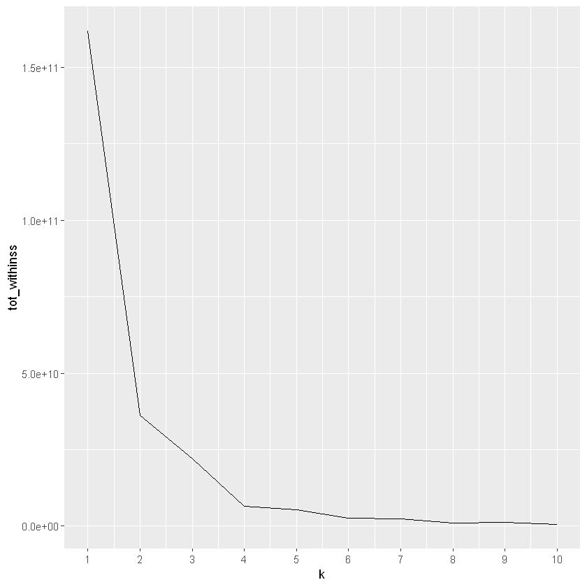
K-means: Elbow analysis
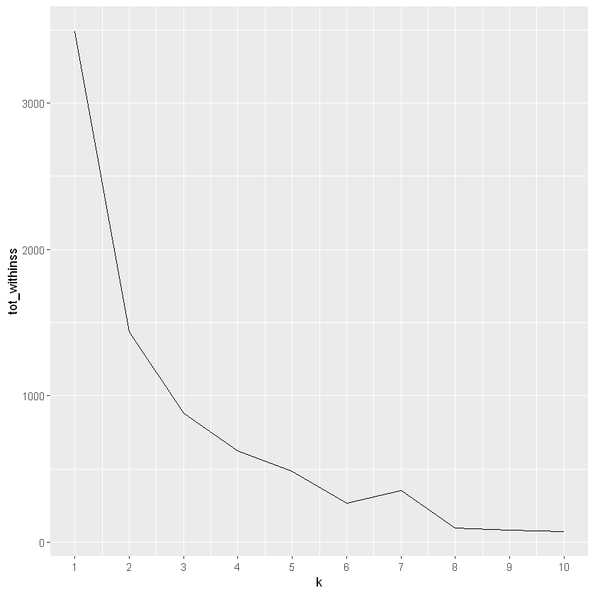
leverage the k-means elbow plot to propose the “best” number of clusters.
# Use map_dbl to run many models with varying value of k (centers)tot_withinss <-map_dbl(1:10, function(k){ model <-kmeans(x = oes, centers = k) model$tot.withinss})# Generate a data frame containing both k and tot_withinsselbow_df <-data.frame(k =1:10,tot_withinss = tot_withinss)# Plot the elbow plotggplot(elbow_df, aes(x = k, y = tot_withinss)) +geom_line() +scale_x_continuous(breaks =1:10)
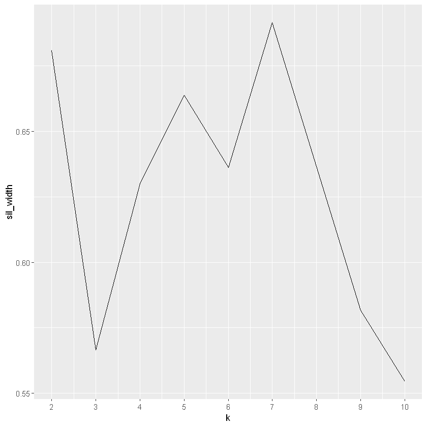
K-means: Average Silhouette Widths
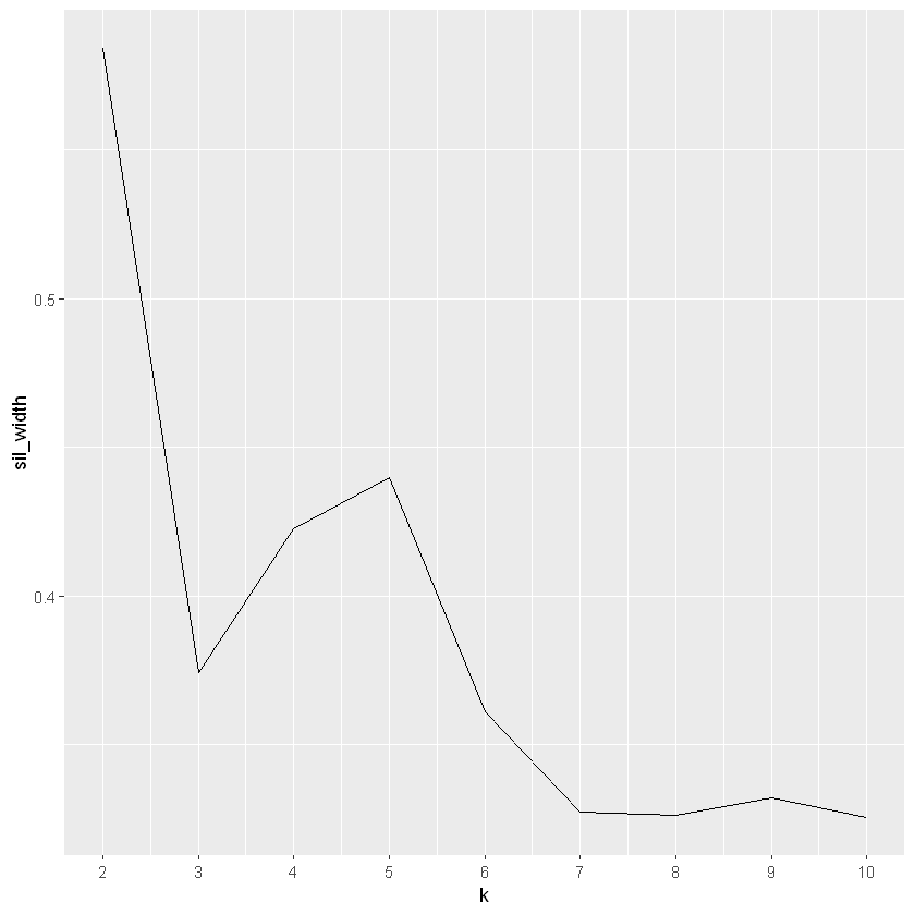
So hierarchical clustering resulting in 3 clusters and the elbow method suggests 2. We will use average silhouette widths to explore what the “best” value of k should be.
# Use map_dbl to run many models with varying value of ksil_width <-map_dbl(2:10, function(k){ model <-pam(oes, k = k) model$silinfo$avg.width})# Generate a data frame containing both k and sil_widthsil_df <-data.frame(k =2:10,sil_width = sil_width)# Plot the relationship between k and sil_widthggplot(sil_df, aes(x = k, y = sil_width)) +geom_line() +scale_x_continuous(breaks =2:10)
It seems that this analysis results in another value of k, this time 7 is the top contender (although 2 comes very close).